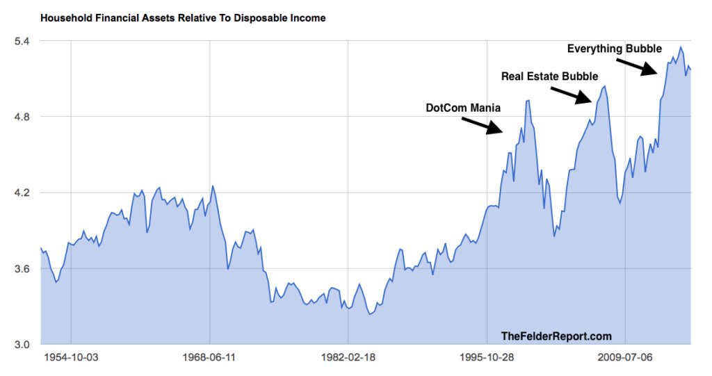
This is basically people's net worth (on paper, i.e. phony wealth that will evaporate), vs how much money they make.
A phony wealth to real wealth ratio, if you will.
I don't get too caught up in these "worst since Lehman" charts, because everything is always worst since Leyman, so don't try to use this as timing for anything.
Yeah, I have been waiting for the crash some time now. Where is my crash, man?
ReplyDeleteYou never know! DB could be in terminal decline though. It's literally the worst bank since lehman.
DeleteBe careful of what you wish for. I hope we all have done enough prepping...
Delete